Nepracujeme pre štát
Client: Menej štátu (Less State)
Services: logo, identity, UX design, web design, web development
Creation of the logo and identity for We do not work for state initiative was a real challenge from the very beginning. How to present in a serious and trustworthy way an organisation which gets together companies that reject state commissions and cooperation with the state?
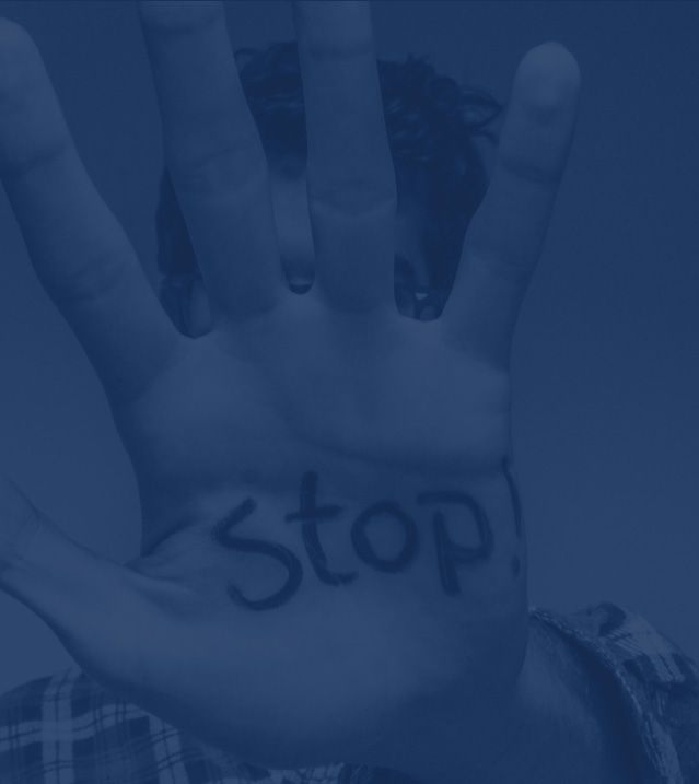
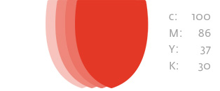
The logo and identity are based on the play with the Slovak national sign. We converted its typical double-cross into the symbol of rejection and non-conformity. The colours are defined by Slovak national colours that have their own meaning. The provocative feature of the project is hidden and thus more sophisticated.
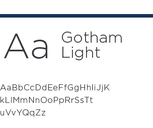
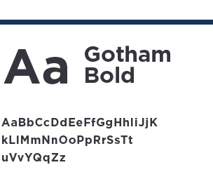
LOGO DESIGN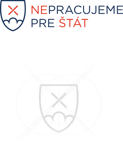
Typography

CORPORATE COLOURS

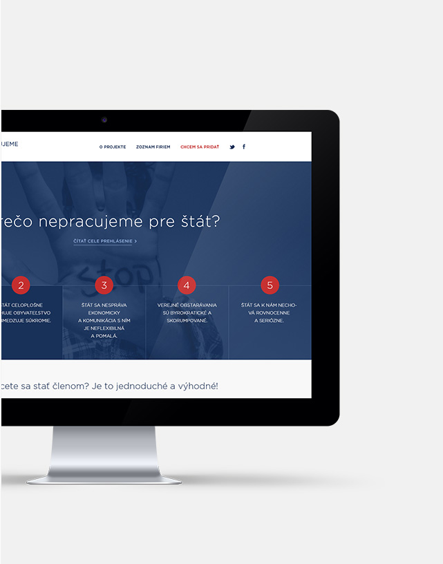
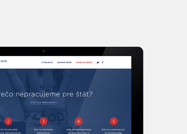
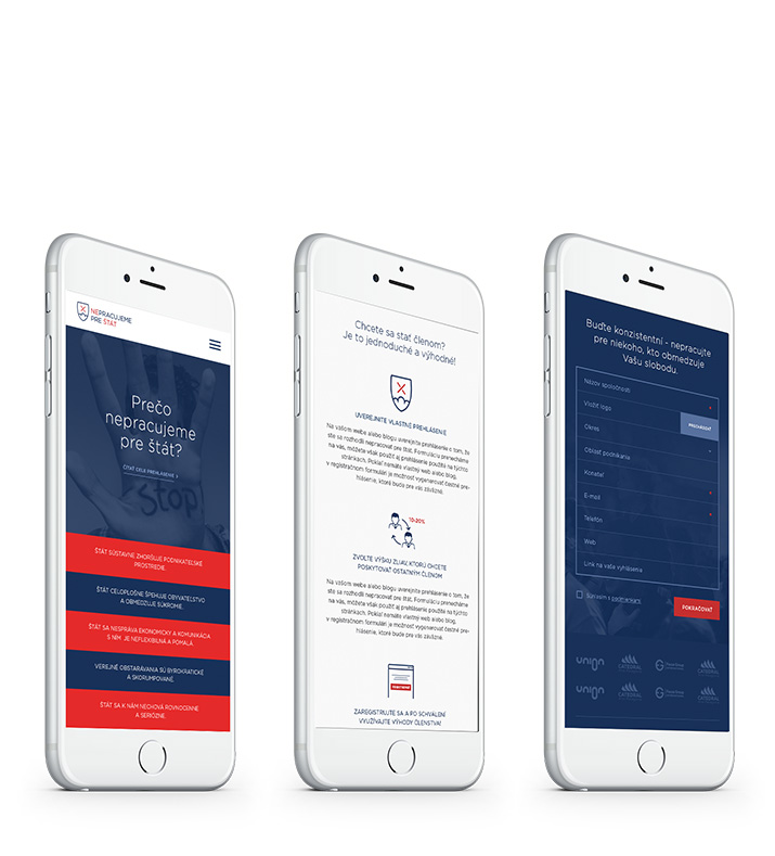
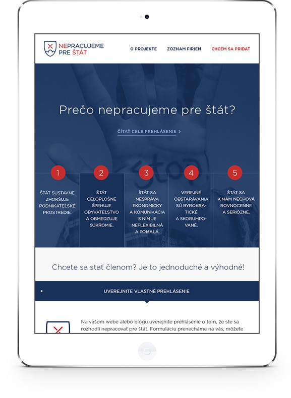
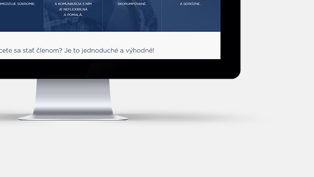
The aim of the website is to present the reasons for the initiative and to help the visitor to find the basic information. That is why we put the five points of declaration right on the first page.
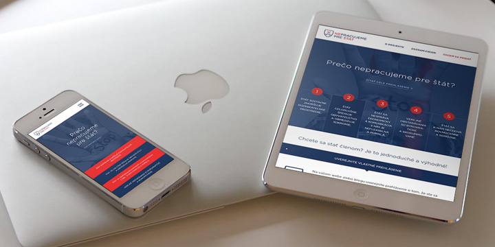
symbols are preserved
in all parts of the website.