
TOUCHIT RE-DESIGN
Client: TOUCHIT
Services: Corporate identity, Graphic design, DTP
TouchIT magazine started in 2015. Shortly after its first issue, the editors contacted us because they needed help with complex re-design. The goal was not only to differentiate the magazine from the competition but also create world-class design. It was not easy. The assignment came with a selection of magazines from all over the world whose level we were supposed to achieve. The readers' reaction was clear – we made it!
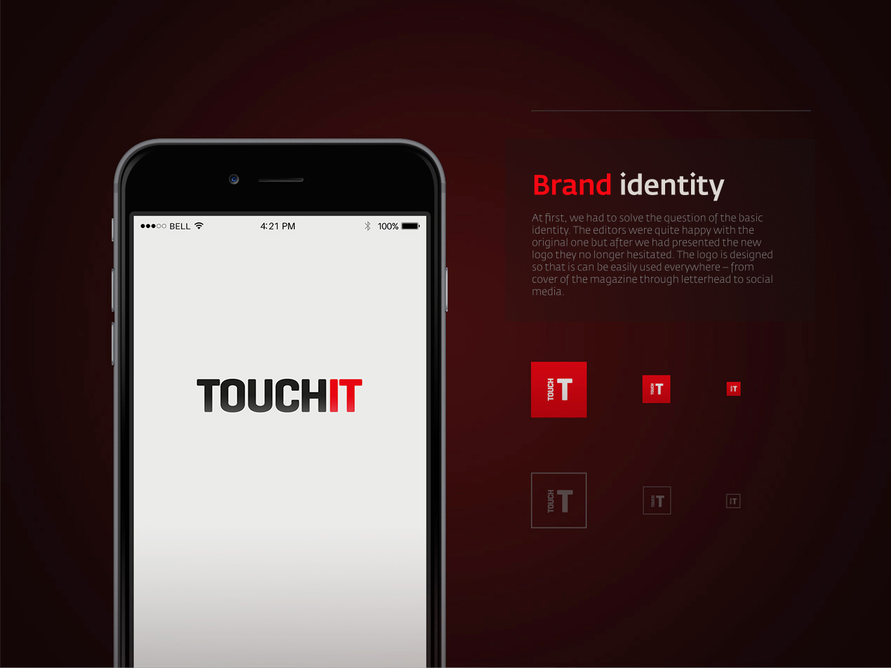


At first, we had to solve the question of the basic identity. The editors were quite happy with the original one but after we had presented the new logo they no longer hesitated. The logo is designed so that is can be easily used everywhere – from cover of the magazine through letterhead to social media.

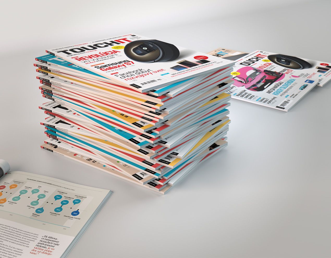
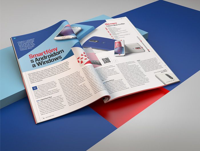
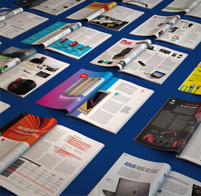
Fresh and modern – that was our goal. We set a basic colour scheme that defines respective sections and parts of the magazine. The cover is less limited – each issue is characterized by different colour scheme of the cover.

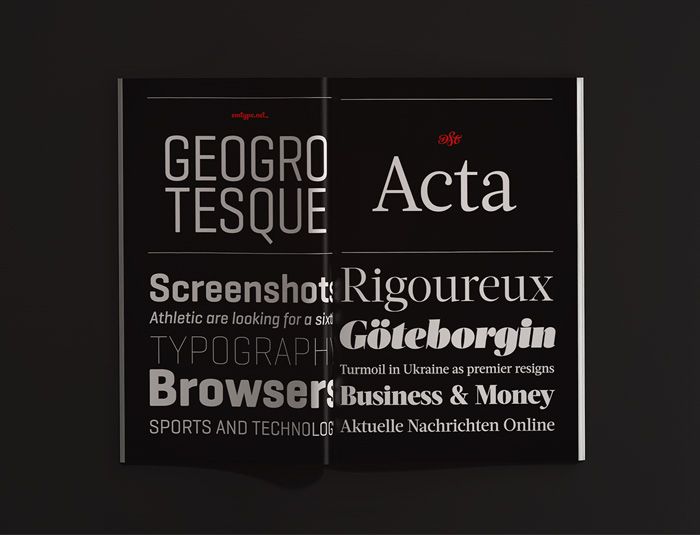
We set two groups of fonts. One for longer blocks of text and the other for creative headlines and high-lights. At the same time, we set a complete hierarchy of articles – from headline to the name of the author.
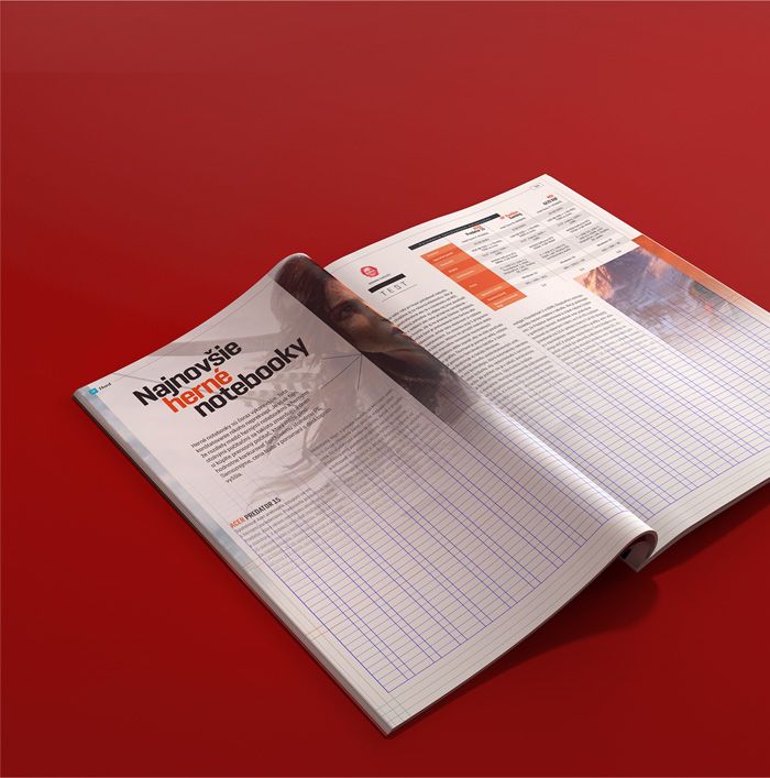
The magazine is divided into sections, parts, and types of articles. The recurring sections have their own stable structure which helps the editors to prepare the content.

We set a detailed grid system which defines layout of pages, columns, and tables. The design defines the recurring graphic elements and how are the sections created.

ux design, project managementPavol Truben
art direction and presentationDrahoslav Páluš
graphic designersJozef Arpa
Kristína Uhráková
Matúš Slovák